Designing for trust in Uber’s onboarding flow

OverviewWalkthrough
Context
flag
Onboarding
Category
flag
Travel
Goals
arrow_upward_alt
Conversion
Biases identified
touch_app
Cognitive Load
dataset
Default Bias
dataset
Framing Effect
touch_app
Priming

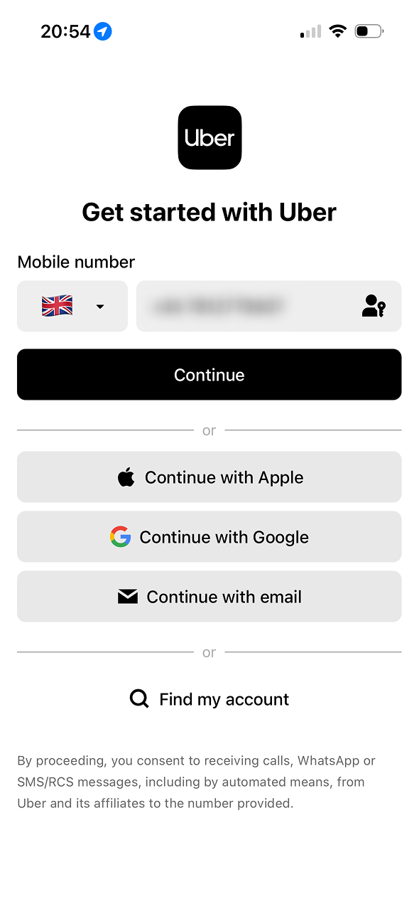
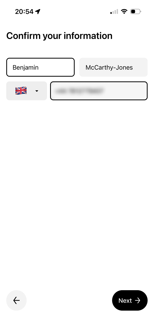
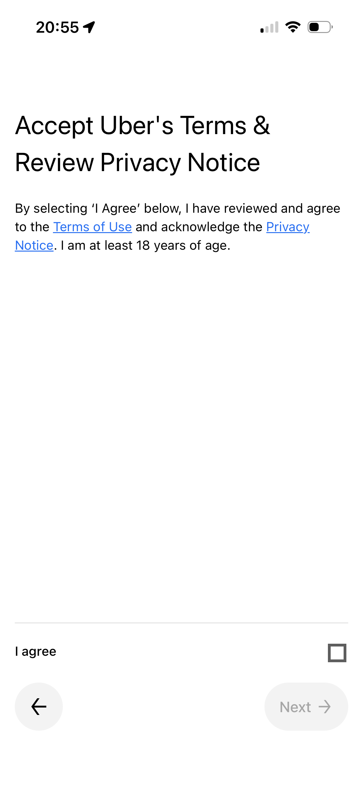
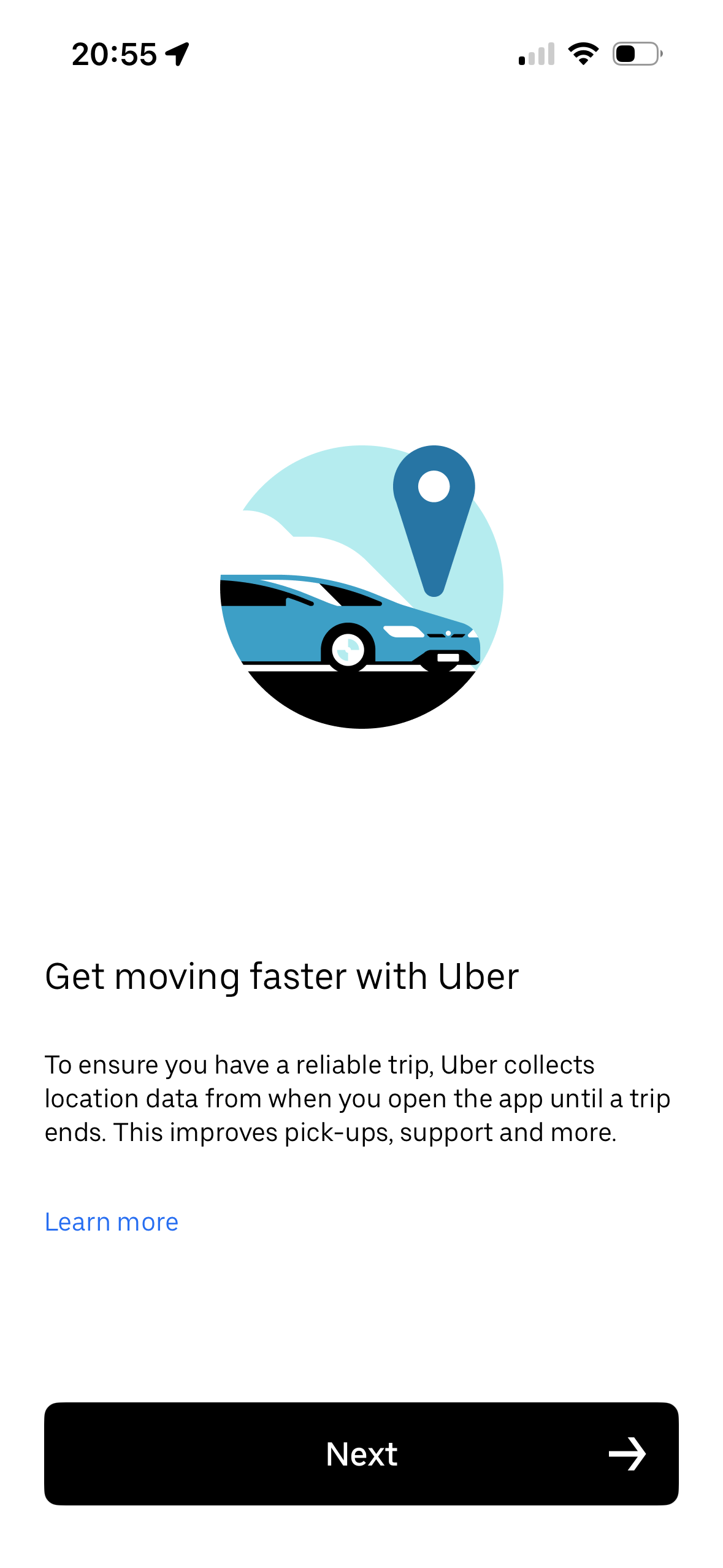
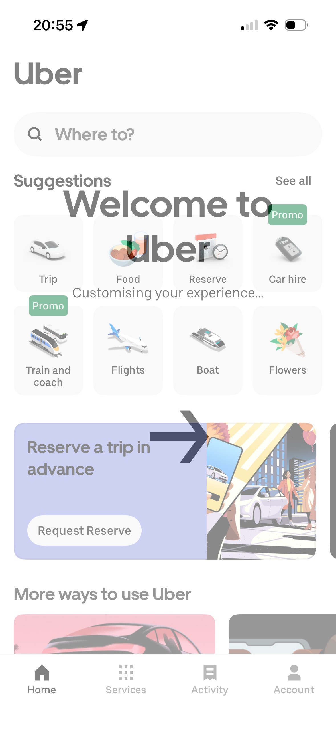
We analysed Uber’s onboarding flow to see how it uses behavioural psychology and it’s full of smart, subtle moves. From the way they frame “getting started” as something effortless, to how they nudge you toward sharing data without it feeling too intrusive, the whole experience is designed to feel smooth and trustworthy. There are trade-offs however. Some screens blur the line between clarity and compliance, and it left me wondering how informed some of those choices really are. This case study dives into where Uber gets it right, and where a few small changes could make a big difference.

The flows we reviewed

sentiment_very_satisfied

What works

  • The flow feels fast, clean and familiar, with minimal cognitive load at each step.
  • Trust is established early, using Uber’s branding and third-party login options like Apple and Google.
  • Language frames progress as effortless, with phrases like “Get started” and “You’re all set” lowering resistance.
  • Defaults and pre-filled fields reduce friction, encouraging users to move forward without much thought.
  • Visual consistency and UI polish create authority, making the experience feel safe and reliable.
  • Subtle nudges support Uber’s goals, like how location tracking is framed as a benefit (“get moving faster”).
  • Completion is rewarded with a clear end point, reinforcing progress through a welcoming home screen.
sentiment_sad

What doesn't work

  • User choice is often implied rather than made explicit, particularly with marketing opt-ins.
  • The terms and privacy consent screen lacks readability, relying on dense legal text without simplification.
  • Framing sometimes leads instead of informs, e.g. “customising your experience” masks data use behind vagueness.
  • Some actions are preselected or more visually prominent, such as the “Allow” button for ad personalisation.
  • The value exchange is never clearly stated, leaving users to assume what they gain from sharing data.
  • Final onboarding messaging misses a moment for personalisation, using generic language where user-specific feedback would boost impact.

Screen-by-screen review

Uber-onboarding-Sign up screen-1-1

Sign up screen

Framing Effect
link
The phrase “Get started with Uber” is action-oriented and low commitment, positioning sign-up as a small, easy step rather than a significant decision. This reduces resistance.
lightbulb
Idea
Add a short headline or subtext to clarify value exchange (e.g. “Seamless rides and more — just one step away”) to activate reciprocity and motivate continuation.
Uber-onboarding-Confirm user details-1-2

Confirm user details

Default Bias
link
Pre-filled fields nudge users to accept defaults, reducing decision friction.
lightbulb
Idea
Pre-fill data with visible edit options to increase perceived control.
Uber-onboarding-Terms and conditions-1-3

Terms and conditions

Cognitive Load
link
Dense legal text increases effort and may deter thorough review.
lightbulb
Idea
Use progressive disclosure or bullet-point highlights for improved cognitive processing.
Uber-onboarding-Location permission explainer-1-5

Location explainer

Priming
link
Midway in flow, clear next step sustains momentum toward completion.
lightbulb
Idea
Clarify when tracking begins and ends to improve trust and reduce ambiguity.
Uber-onboarding-Welcome and preferences intro-1-4

Preferences intro

Framing Effect
link
"You're all set" language positively frames marketing opt-in.
lightbulb
Idea
Frame opt-in more clearly as a choice, not a default, to avoid potential confusion.
Uber-onboarding-Welcome screen-1-7

Welcome screen

Framing Effect
link
The use of the phrase “Customising your experience” frames Uber’s data use and service tailoring as a benefit, not surveillance. It implies user-centric value, subtly justifying the permissions granted earlier.
lightbulb
Idea
Replace the generic “Customising your experience…” with a short line like “Tailored recommendations ready for you” to increase clarity and perceived value.
Uber-onboarding-Ad personalisation consent-1-6

Ad personalisation

Default Bias
link
Prominent 'Allow' button nudges users to opt-in without full deliberation.
Framing Effect
link
'Better ads' message frames data sharing as beneficial.
lightbulb
Idea
Ensure 'Decline' and 'Allow' have balanced visual weight to avoid coercive default bias.

Similar case studies to explore